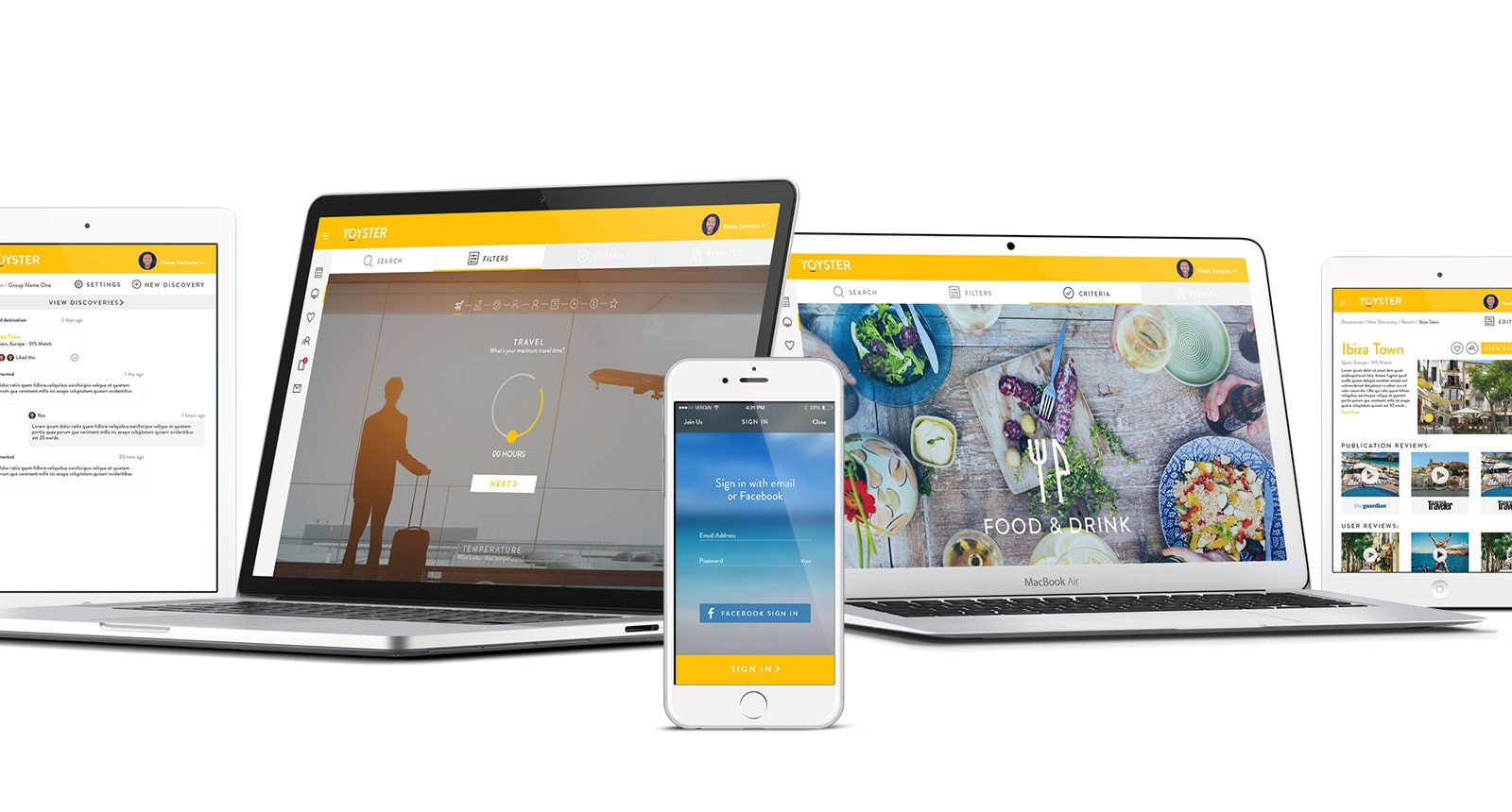
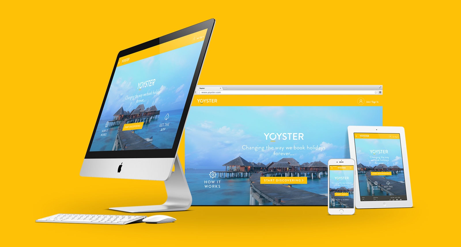
After designing the app for tech start-up Yoyster, we were asked to translate the app design into a similar online experience ensuring the same seamless experience as the app across desktop, tablet and mobile.
This obviously meant creating a dynamic design, extending the features of the app across the desktop and mobile versions of the website.
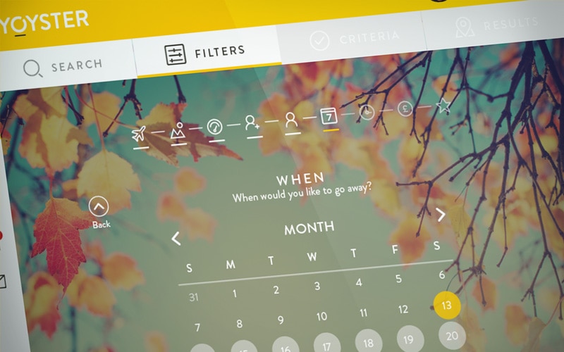
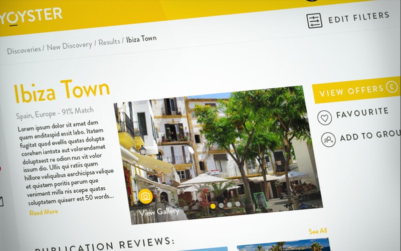
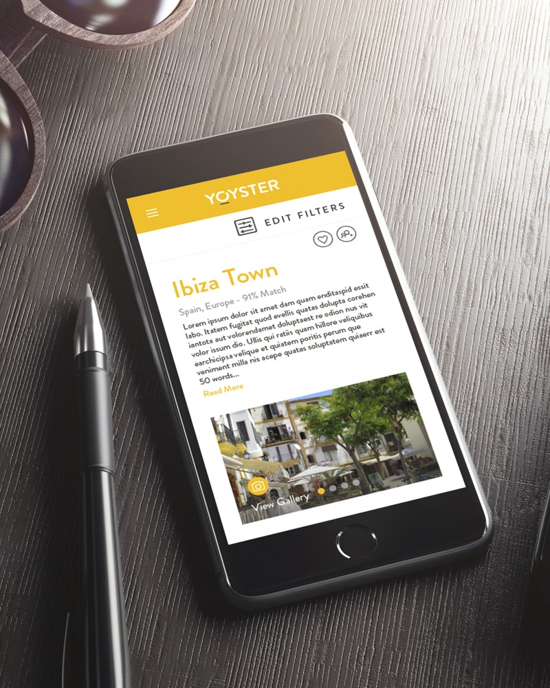
The key to designing any mobile responsive website is to anticipate the way the content blocks will react on the different devices and align this experience to the journey we expect the users to take.
The project involved several iterations of the design complimented with user testing to ensure the best possible user experience.
Want to know more?
If you found this interesting or have a project of your own that you’d like to discuss we’d love to hear from you. Simply drop us a line here.