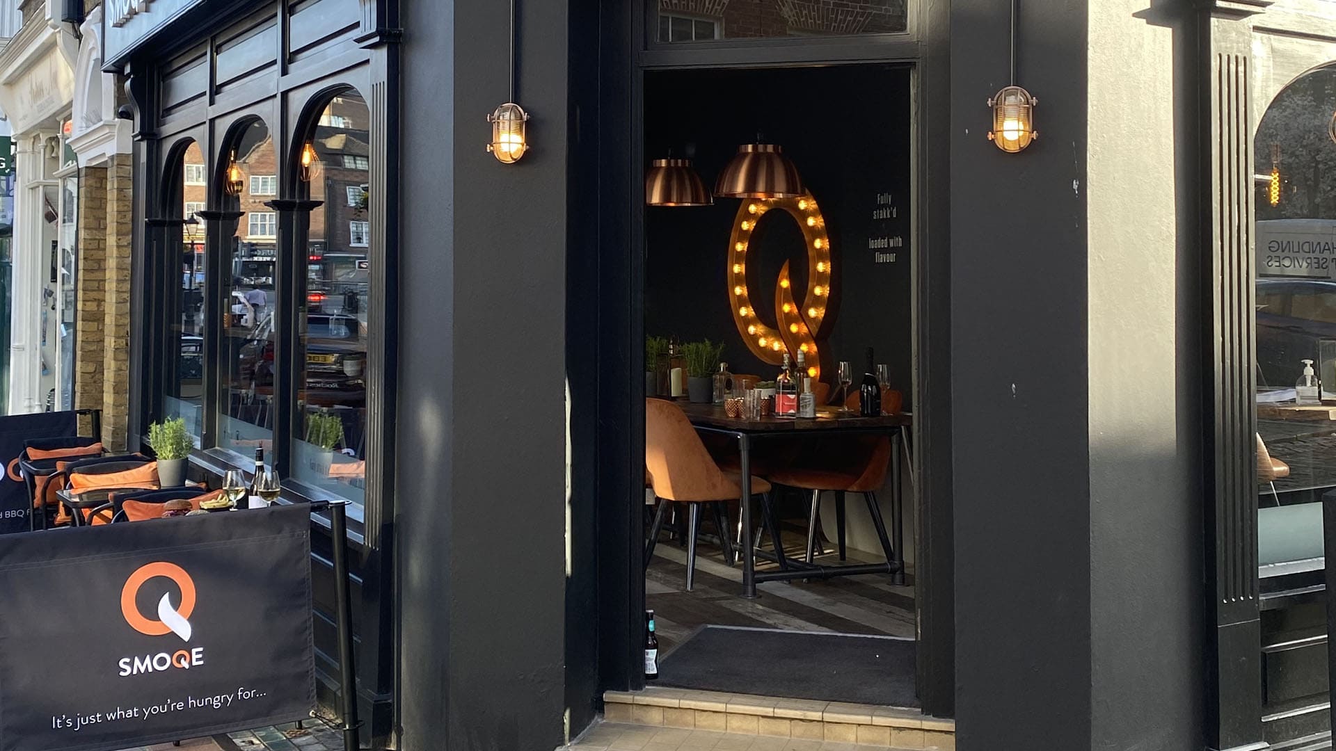
The very early stages of the project involved naming sessions and identity workshops to realise their brand story. The owners love to travel and have a passion for food, and they wanted to recreate their favourite American-style smoky BBQ foods. These early sessions quickly established a visual identity concept centred around the Q in the unique spelling of the company name.
Interior and Signage Design
As a corner unit and with limited space, the store design needed to quickly establish Smoqe as a presence on Rochester High Street and enable the team to seat a range of dining customers while maximising the covers.
We designed an eye-catching light feature for the interior of the main space, which is visible from the street and draws visitors inside (it’s also a social media hit with local influencers). The signage and exterior graphics for the restaurant extend the character and clean lines of the brand identity while still packing plenty of personality.
Found this interesting?
If this has sparked some ideas for you, we’re always happy to chat. If there’s something we can help you understand or put together, let’s talk…
