When it comes to designing Apps the user experience needs to be as easy and intuitive as possible. Even if a new app is built to be intuitive, mobile users can quickly become frustrated if they have difficulty learning how to use a new service.
The team behind Yoyster, a new app that aims to introduce a new way to find and book holidays, understood how this initial user experience was a key to the apps success.
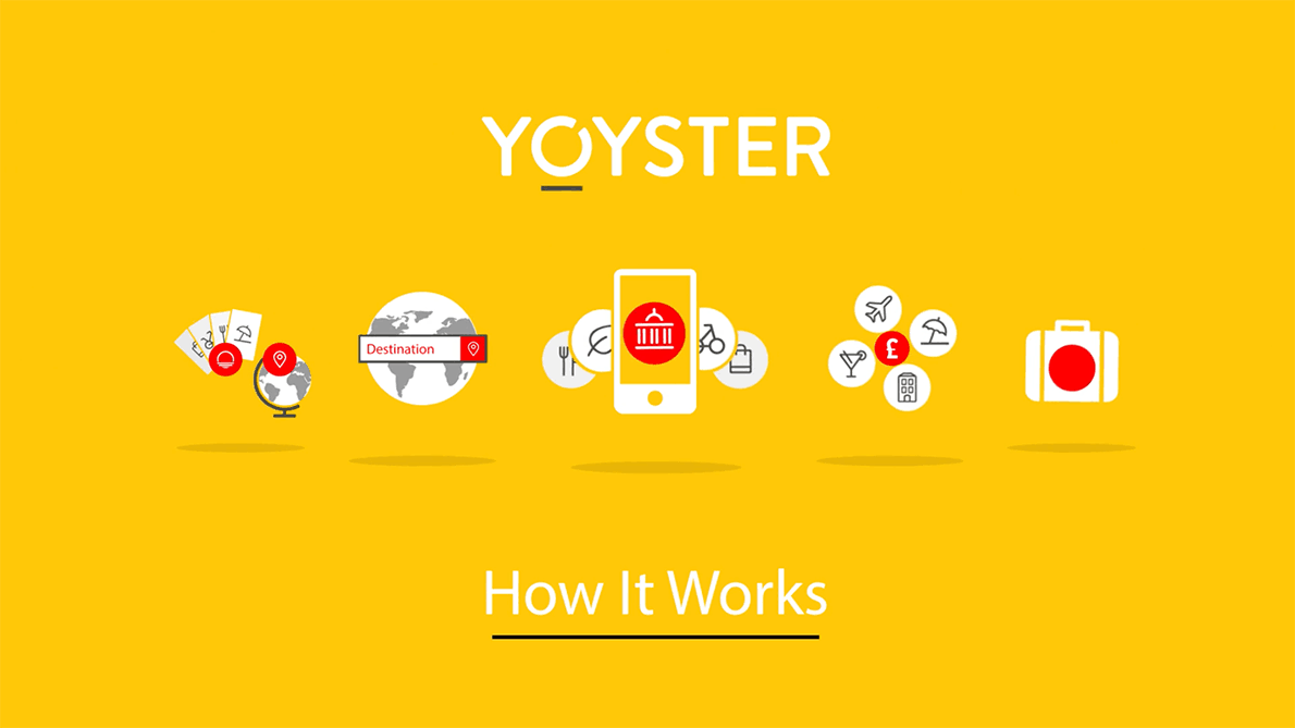
They asked us design a How-to video animation that would quickly and concisely explain how the Yoyster works in 60 seconds. Using the app design layouts and brand identity imagery we had already created had all the graphic ammunition we needed to put together the animation.
Check out the finished video here…
Want to know more?
If you found this interesting or have a project of your own that you’d like to discuss we’d love to hear from you. Simply drop us a line here.
