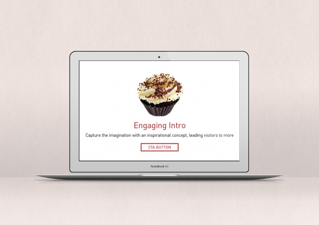
As mobile internet browsing and tablet use continues to grow, the single page website has become a staple of the digital landscape. A simple scrolling page, offering an easy way of browsing, is a very practical way to deliver information to touch devices and probably why they are proving so popular.
Is there a structure to one page websites?
A lot of thought and refinement will go into creating a single page website to keep it looking simple and clear. With constant iterations of development the effectiveness of landing pages or one-page websites has grown steadily over the last few years. We may not be fully aware of it, but our behaviour and online browsing habits are being analysed and studied to ensure the information we are delivered is as close to what we are looking for as possible.
So how does it work?
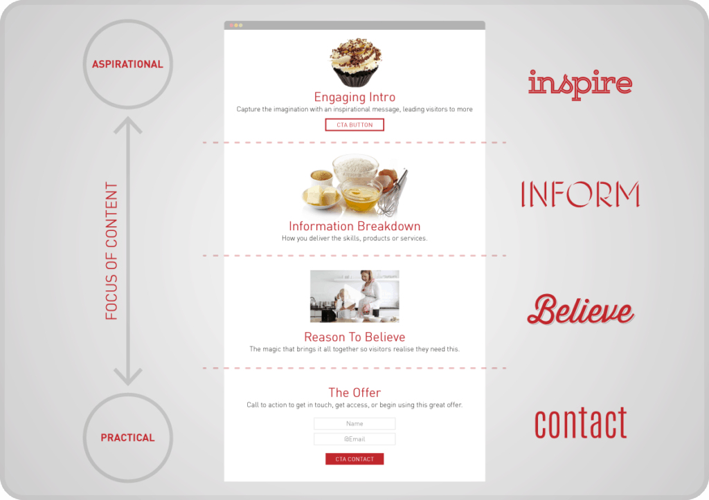
There is a clear logic to the one-page website or landing page. You start with an aspirational offer and then gradually introduce practical messages as you build up to your direct call to action. It’s a tried and tested advertising technique: sell us the dream and then show how us how attainable it can be.
There may be additional elements to help build your story, but the basic component parts of the most successful one-page websites all tell a story using a similar narrative structure:
Step 1 – Inspire
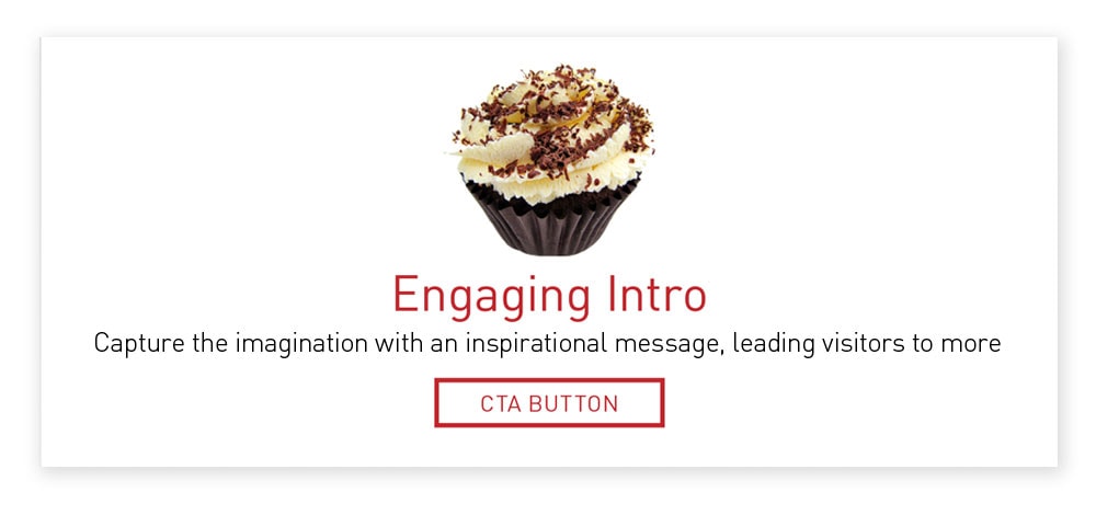
The introduction should be aspirational. The copy and imagery may be conceptual, inviting you to imagine yourself using the product or service, Airbnb is a great example of this method. Their landing page introduction conveys a real sense of community and belonging on a global scale using emotive language and aspirational photography. Discovering the world via their service is easy and enjoyable.
It’s so tasty we can almost touch it…
Step 2 – Inform
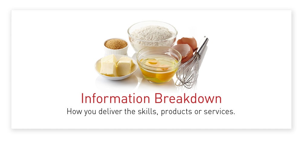
While the concept is innovative the components that go into creating the website page are quite familiar. It will be built from ideas and themes we already understand: you’ve planted the idea, now show your customer how to achieve it. The logic is already proved, this new way of delivering it may be the magic dust that makes it special.
You know the recipe, so getting the right ingredients will deliver the expected results…
Step 3 – Believe
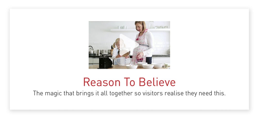
Giving your visitors a reason to believe is a key stage and where you need to get buy in for your offer or idea. You should outline the benefits of using your service or buying your product with engaging content. Beautiful product shots, customers testimonials or a video demonstrating how well your service works can go here.
The secret is to make everything you do appear effortless, but also refined and developed enough so that your visitors appreciate the quality and value that has gone into making the website. This perceived effort is what is more likely to convince your potential customers that it’s worth giving your new idea, product or service a try.
If we could do it ourselves we would, but from experience knowing a recipe and making a cake are further apart than we think.
Step 4 – Contact
The call to action is where you get in touch, place your order, or sign up to start making use of the wonderful service. If you are competing on price , your deal should be pitched to appear better value than your visitor may have been expecting after the inspirational intro and amazing benefits of your service has lead them to believe.
The goal is to get your visitor to think ‘Wow I really NEED this, and yet it only costs/requires my email/takes five minutes. Lets click NOW’…
Single page websites or scrolling hompages are ideal for special one-off promotions or for launching a new business. If you structure your business or service around these four logical steps your visitors are more likely to stick around and buy into your idea.
Got you thinking?
If you would like to know more about one page websites or have an idea you’d like to discuss, please get in touch. We’re always happy to have a chat and help in any way we can.
